2024
RBC’s Chequing Account Pages
A re-design of RBC’s personal bank account pages to increase conversions, and enhance the user experience.

TL:DR
Problem
The existing RBC personal bank account pages were repetitive, unclear about offers and costs, and didn't provide users with the confidence they needed to open an account. RBC wanted to increase chequing account conversions by redesigning the pages with a focus on personalization, account benefits (Vantage), and its fee-saving Value Program
Solution + Impact
A redesign which simplified account differentiation and clarified benefits, leading to a 12% increase in conversions across personal account openings.
Role
UX Designer
Focus
Chequing account page, product pages.
Timeline
4 months
Platform
Desktop
Client
Royal Bank of Canada

The Process
Designs were already underway when I joined the project
Upon joining the project, the design of the account overview page was already underway. This is a page that provided an overview of all of RBC's account offerings - both Chequings and Savings accounts.
Each page was being designed in a vacuum
The team was going high fidelity on the account overview page without considering how the other key pages were interconnected in the flow.
What I proposed…
I proposed zooming out and looking at the account pages as a 3 step flow. I decided to conduct additional research to truly understand our user's needs and exploration journey rather than rely on assumptions.


Each page has a different job and narrows the focus: acct overview shows all account types, the cheq accounts page compares accounts, and a product page dives deeper into all features of a single account.
Understanding user needs
To make educated design decisions, I needed to understand how users navigate the existing account pages. What I did:
Usability studies
30 qualitative, unmoderated user sessions on UserTesting.com.
Competitive analysis
A review of how other banks structure their account pages.
UX audit
I conducted an expert review of the existing flow, drawing on usability principles to identify and document the key problems.
Key Findings
😵💫
Lack of offer/rebate clarity prevented users from opening an account.
“I don’t understand the numbers here... I truly don’t understand, I truly don’t know”

🤷♀️
Confusion around "Vantage" benefits
"I'm confused about RBC Vantage... it made me think it was an account, but it looks like some sort of an add on?"

😩
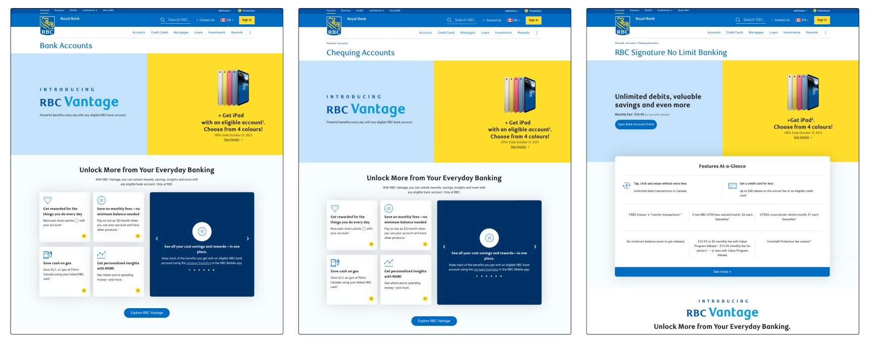
Redundancy of imagery and text led to confusion and cognitive overload.
"isn't this the same page I was just on?" [when navigating between Acct overview to cheq acct overview]
🤓
Users want to make an informed decision when opening a bank account.
"I'm not ready to open an account yet...I'd need to read some more info about the account and conduct some comparisons."

🎁
Users want to know how account benefits apply to their specific situation, without having to do additional work up front.
“I would want to see what exactly is relevant to this account to maximize my value out of RBC”

“Just please be simple and honest...be trustworthy”
-Research participant
The research also revealed an interesting insight around personalization
Marketing's goal with personalization:
Automatically presenting the users with recommended accounts, based on their assumed user segment.
What participants wanted:
Participants wanted to know how specific benefits and prices apply to them.
Establishing design principles
The learnings from the discovery phase led me to establish design principals, to guide the team through the design and decision making process.
01
Simplicity and clarity
Offer information is upfront, clear, and specific to the visitor. This builds trust.
02
Reduce, Reuse, Do not Recycle
Cut copy, omit redundancies, and limit RBC fluff and jargon.
03
Present only what’s relevant
Not every page should aim for conversion. Each page serves the visitor's stage of discovery.
04
Provide users with agency
Provide users with methods for account exploration/deep dive.
Two more guidelines covered the benefit programs the project had to feature:
The Value Program
Be transparent about what an account costs with the program applied, and clearly explain how to apply it.
RBC Vantage
Make clear that no action is needed to use Vantage benefits, because they are free.
Design decisions
How should the Advantage Banking account be presented?
This bank account had 2 offers: a student offer and newcomer offer. However, the student offer had its own product page, presented as a student "account". It wasn't clear how to best present this account on the chequing account page.
Option 1:
One Advantage account, with both offers shown as offers

👍
Why it works: Matches how the account really works, and reduces card repetition
👎
Risk: Doesn't match the navigation: Student has its own page and the Newcomer offer doesn't
Option 2:
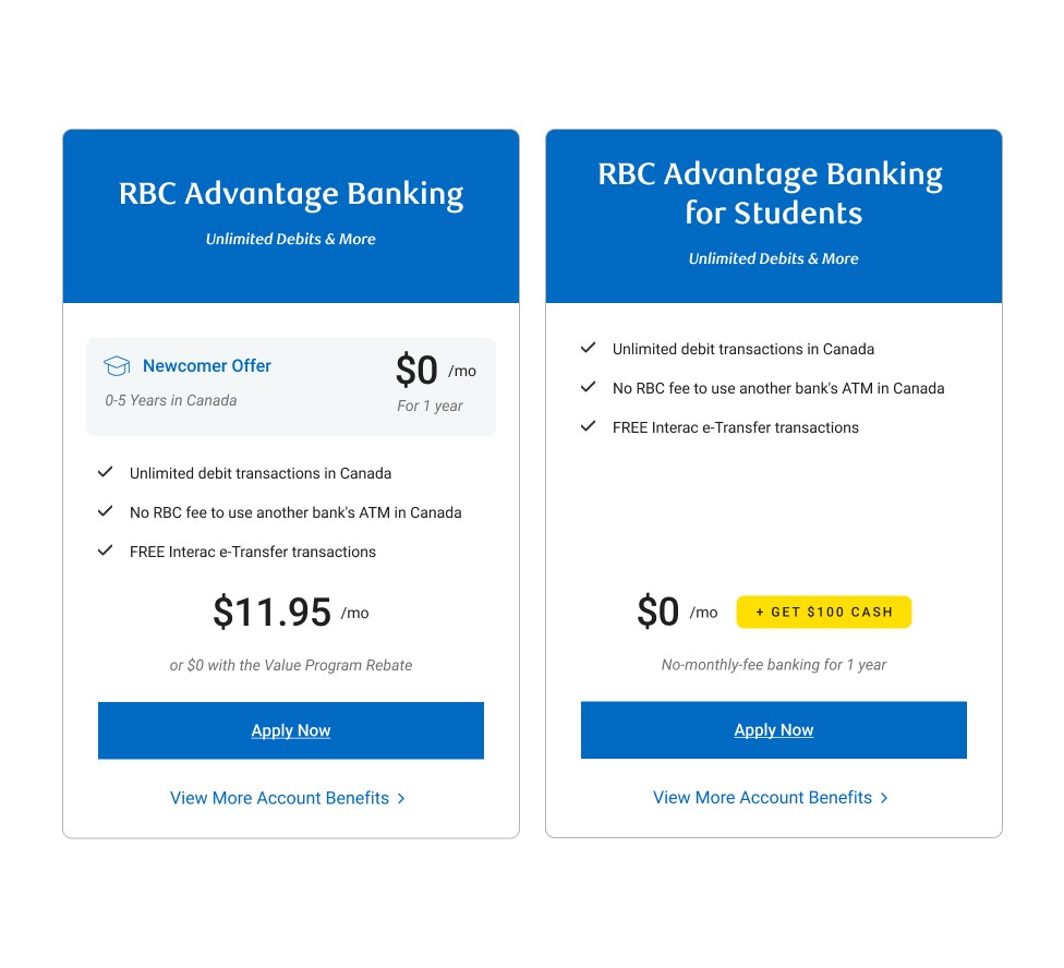
Two accounts, with the Newcomer offer shown as a benefit of Advantage (chosen)
👍
Why it works: Matches the navigation, and the Newcomer offer is up front
👎
Risk: Could cause confusion about the differences between Advantage accounts
The decision:
Option 2 followed the information architecture of website's main navigation, and made it possible to direct users to the Student account with the primary CTA.
Consistency across pages
While marketing wanted consistency across the accounts overview page and chequing accounts page, I pushed to break consistency for 3 reasons:
01
The existing pages were so consistent that visitors couldn't tell them apart.
02
The overview page was approved before the full flow was mapped, so matching it would carry its assumptions and risks into every page.
03
Each page has a specific job in the user's exploration flow. While the account overview explores, the chequing page compares, and the product page decides.
What this meant in practice
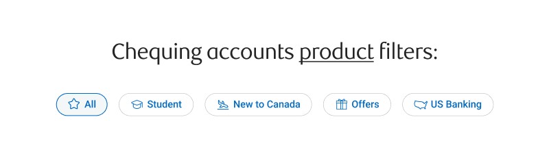
On the already designed account overview page, filters narrowed the accounts displayed on the page based on user segments.
Repeating the same filters on the chequing account overview page meant some accounts wouldn't be shown in any of the segments.

The decision:
The Chequing Overview page focuses on account products, rather than segment targeted bundles. Therefore, the labels in the filters on the chequing account page need to be directly related to the account product offering.
As well, an all filter was added, helping users make an informed decision by presenting all products upfront
Presenting benefits on the account cards
The account cards would highlight the top 3 benefits per account, prioritized by the marketing team.
Initial design
I quickly saw this caused repetition in side-by-side cards, reducing clear benefit differentiation.

The challenge
How might we present the most valuable benefits at a glance, while showcasing the unique differences of each chequing account?
The solution
I grouped together the overlapping benefits that apply to all RBC accounts, and created a visual treatment that distinguished them from unique account benefits.


The outcome
A dedicated space to highlight unique features in account cards, while reducing the height of the common benefits area, bringing unique content higher up on the page.
Increased clarity around RBC Vantage - which describes perks shared across all RBC accounts at no extra cost.
The Final Designs
A header that leads with the page, not an offer
Each page looks unique and personable with the introduction of lifestyle imagery. The addition of breadcrumbs orients the user, as well as the page name as the focal point.
Original issue: Redundancy of imagery and text led to confusion and cognitive overload.


Clarity around account fees
An account fees section is shown on every account page, where users can clearly understand the fees structure.
Original issue: Lack of offer/rebate clarity prevented users from opening an account.
The Value Program, explained.
A Value program rebate calculator is included on the page, allowing users to understand exact account fees without leaving the page like before.
Original issue: Lack of offer/rebate clarity prevented users from opening an account.


Personalized content
The product page shows the credits cards eligible for a rebate for that exact account. User no longer have to dig through the terms and conditions to understand account perks.
Original issue: Users want to know how account benefits apply to their specific situation, without having to do additional work up front.
Reflection
The biggest challenges
Working within a project already underway
Challenge: the project was already underway, so I had to work within pages that were designed and almost fully approved, instead of shaping the direction of every page in the flow. It also made buy-in from marketing harder, because my approach created inconsistencies with what had already been designed.
What I did: I proposed zooming out to map the whole flow, and worked to save the overview page even though much of it had already been approved. I defended my design decisions to stakeholders using data from our research.
Vantage was a sensitive topic
Challenge: our line-of-business partners had a strong directive around Vantage, but our research showed something very different about user understanding.
What I did: I kept Vantage featured, as the business required, but changed how it's presented visually and with explainer copy.
What I'd do differently
Get designs in front of users sooner
I spent a lot of time iterating on designs visually without testing them with users. Next time I'd run quick A/B tests before iterating further, which would give me stronger evidence and rationale for stakeholder buy-in.
What I'd do next
I left the team before project delivery to accept a full-time offer with RBC Wealth Management. But if I was still working on the project, this is what I'd do next…
Validate designs through usability testing
I'd go through some of the initial questions we tested with users, and re-test them with the new designs. I'd be most interested in knowing whether users have clarity around pricing, as well as their understanding around Vantage and the Value Program.
